 Wow! eBook
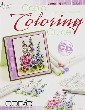
Copic Coloring Guide Level 4: Fine Details
Author: Colleen Schaan (Author), Marianne Walker (Author)
ASIN: 1596355751
Publisher: Annies
Edition: Pap/Cdr edition
Publication Date: 2013-09-1
Language: English
Paperback: 64 pages
ISBN-10: 9781596355750
Book Description
About the Author
Excerpt. © Reprinted by permission. All rights reserved.
Copic Coloring Guide
Level 4: Fine Details
By Colleen Schaan, Marianne Walker, Tanya Fox, Matthew Owen
Annie’s
Copyright © 2013 Annie’s
All rights reserved.
ISBN: 9781-59635-575-0
Contents
Our Thoughtful Readers,
Let There Be Light,
Mixing It Up,
Coloring Detailed Images,
Putting It All Together,
Creative Coloring Projects,
Contributors,
About the Authors,
Buyer’s Guide,
CHAPTER 1
Let There Be Light
In this final book of the Copic Coloring Guide series, we want to take you to the artist level, thinking about and coloring images in a realistic and true to nature way. To do this, we need to tackle the topic of light. Talking about light source and creating highlights and shadows can be daunting, so we want to start with some basic terminology. Often, using and understanding the same language can break down barriers of frustration and uncertainty.
Basic Terminology
While there are many more terms than what we will cover here and much more detailed descriptions of these terms, we want to keep this section simple and present just the basic, essential information. The definitions here should be enough to make you comfortable tackling the coloring of any of your stamped or digital images.
Light Source: The direction from which a dominant light originates. The placement directs the eye and will affect every aspect of the image. The light source visually tells where to add light values and dark values.
Value: Different shades of gray from white to black.
Shading: Gradient blending from light value to dark value.
Highlight: The area(s) where light hits the object first and fullest. Illustrated by the very lightest value.
Mid-Tone: The area(s) not in direct light or direct shadow.
Form Shadow: The area(s) on an object that receive little to no light. Often called core shadow.
Cast Shadow: The area(s) on the adjacent surface where the light is blocked by the object. Cast shadows also vary in tone and value.
Contrast: The difference between light and dark values.
Low Contrast: An image having only light and middle values. The image will tend to look soft and flat.
High Contrast: An image having a variation of light to dark values. The image will look more visually appealing and 3-D.
Checking Images for Contrast
Here are some ways to check an image for contrast:
Squint
By squinting, the details lose focus and the value becomes more visible.
Hold Image at Arm’s Length
By holding the image further away, the details lose focus and the value becomes more visible.
Hold Image Upside Down or in a Mirror
The image itself loses shape and the value becomes more visible.
Tu Image to Black & White
The color is removed and the value becomes the main focus.
The Importance of Value
Value visually defines an object and gives it depth and dimension. Without a variety of light and dark values, an object appears as flat as the paper it is illustrated on.
Here is an activity to help train your eye to see value:
Remove all color and replace it with shades of gray. When an image is colored, we tend to focus on the hue instead of the value. By removing the color and using different shades of gray, we can see the value without the distraction of color. This is called a grayscale or a value study.
Now let’s look at the same apple image with all color removed.
It’s even more helpful to go one step further and create a modified grayscale to show value.
We will be using this type of value study throughout the remainder of the book. We strongly suggest that you begin playing with images and creating your own value studies for them.
Light Source
We hope this next section gives you a “light bulb” moment. We can’t stress enough the importance of light in your images. It is vital that you identify your light source and plan the placements of highlights and shadows before you pick up a marker.
Using the same simple apple image, let’s take a look at how the light in an image changes with movement of the light source.
First Value Study: Light Directly From Front
In this first value study, the light source is coming from directly in front of the image. Note how the top of the highlight follows the shape of the apple as it curves away from the viewer. Notice too how there is a darker shadow near the stem where the apple curves down into itself. Also observe how the underside of the leaf is brightly lit while the top of the leaf is a mid-tone and shadow.
Second Value Study: Light Directly From Upper-Left
Let’s change up the light source and see how it affects the image. Here is a value study with the light coming from the upper-left. Notice how a large portion of the left side of the apple is highlighted and that the shape of the highlight (and shadow) follows the curve of the apple. Study how the leaf blocks the light from hitting the apple and creates a crisp, dark, cast shadow on the top of the apple. Notice that the cast shadow of the apple is the same basic shape of the apple. (More on this later.) Note too how the top of the leaf is fully highlighted and the underside is in shadow.
Third Value Study: Light Directly From Upper-Right
Let’s move the light to the other side. This value study has the light coming from the upper-right. Notice how the highlight hits the top of the apple and wraps around the curved shape while the shadow fills in the space around the stem and along the left-hand side of the apple.
So, which is the best light source? Well, that’s for you to decide.
The Color of Light
Did you know that light has color? To realistically illustrate light, we need to take the color of the object and the color of the light into consideration.
Most often, we ignore the color of the light and only focus on the color of the object. We illustrate light by coloring the highlights on an object a very light shade of the mid-tone color or the color of the object itself as is demonstrated by the light purple highlights on this zinnia.
In reality, the color of the light source affects the color of the highlights on an object. Here is that same zinnia image colored with a slight yellow hue added to the highlight as if the container were sitting outside in the sun.
Shadows
Me & My Shadow
While light plays the leading role, the award for best supporting actor has to go to the shadow. Whether form shadows or cast shadows, shadows help give depth and dimension to an object.
Let’s begin with an image without any variations in value. Notice how flat and boring the image is. It’s dull and without any real character or distinction because it has no highlights or shadows.
Here is the same image in modified grayscales showing two different light sources. The first shows a light source from the upper-left.
The second shows a light source from the upper-right. Notice that the images have both form shadows and cast shadows.
Form & Cast Shadows
Here we have the finished image with shading and form shadows added. Notice the crisp shading on the apple and the bright highlight. This implies the surface is smooth and very shiny. Observe the softer shadow on the belt holding the books together. This confirms the belt is a soft leather and isn’t reflective at all. The books have a slight highlight at the top and shadow on the bottom, because the light source is coming from the upper-right.
Let’s take the image one step further by adding cast shadows.
Notice the shadow that the apple casts across the book cover. Look closely to see the shadow cast on the side of the pages by the bookmark and the belt, and notice the shadow cast on the surface the books rest on by the end of the belt and the books themselves.
Shading With Undertones
Most of the time, shadows are added at the end of the coloring process. While there is nothing wrong with this, there is another technique that can be used to create interesting depth and color tone. One of the techniques painters often use is underpainting, or blocking in highlights and shadows at the beginning of the painting process. This process is similar to creating a value study. Because Copic marker ink is translucent, we can take advantage of this same technique to help build glowing highlights and rich shadows. Follow this step-by-step tutorial for underpainting an image:
[ILLUSTRATION OMITTED]
Materials
White smooth cardstock
Apple Blossom digital image
Markers: B41, R24, R81, V95, Y11, YG03, YG17, YR14
Colorless Blender (0)
Computer with printer
Step 1: Choose a light source. Add light yellow (Y11) or orange-yellow to areas having the brightest highlights. Flick toward the mid tone for easier blending.
Step 2: Add a mid-shade gray or a de-saturated blue, green or violet (V95) to the areas that will be in shadow.
Step 3: Base leaves with YG03. Add shading with YG17 and blend gently.
Step 4: Add R81 to flower petals and fade to white with Colorless Blender at edges.
Step 5: Leaving the yellow highlight visible, add YR14 and R24 to the apple and blend gently.
Step 6: Add sky with B41 and fade to white with Colorless Blender.
Remember that shading is the gradient blend from light to dark, and shadows are any dark areas in an image and are either form shadows or cast shadows.
Sources: White smooth X-Press It Blending Card, markers and Colorless Blender from Imagination Inteational Inc.; digital image by Marianne Walker.
Highlights, Textures & Surfaces
Besides giving us clues as to the setting and light source type, highlights can also tell us a lot about the surface and the texture of an object. Soft surfaces that absorb the light tend to have soft highlights and shadows and have a smooth gradient blend between the two. Hard, smooth surfaces that reflect light will have crisp highlights and shadows and hard lines with little-to-no blending between the two.
Soft Textures
Notice the soft blends between the highlights and the shadows on the clothing of the couple in this image. The viewer knows the clothing is a soft fabric (like cotton) and not stiff or shiny (like leather) because of the smooth blending and soft highlights.
Hard Textures & Reflective Surfaces
On the other hand, we know the scooter is made from metal or hard plastic and will have a smooth, reflective surface. It’s important to know how to create highlights to illustrate this.
The most common way to show a highly reflective surface is to leave the highlight white. This will create the most visible contrast.
Follow this step-by-step tutorial to create reflective highlights:
Materials
White smooth cardstock
Vespa digital image
Markers: B91, B95, B99, C3, C4, E000, E11, R29, R42, R59, Y00, Y21
Opaque White pigment
Paintbrush
Computer with printer
Step 1: Study the partially colored image and orient yourself with the current light source. Here, the light is coming from the upper-left.
Step 2: Decide where the highlights are going to be on the scooter and outline them with a mid-tone color.
Step 3: Fill in the rest of the scooter with the mid-tone color. Make sure to avoid the white highlight areas.
Step 4: Add dark values to the shadow area and blend toward the highlight. Make sure to leave the highlight white with sharp edges.
Sources: White smooth X-Press It Blending Card, markers and Opaque White pigment from Imagination Inteational Inc.; digital image by Marianne Walker.
CHAPTER 2
Mixing It Up!
By this point in the series, all of the basics have been covered — color choice, blending, lighting. But don’t think we’re going to stop there. In this chapter, we will share tips and tutorials on how to get unique and interesting looks beyond your basic Copic coloring. Step up your images by adding details with Multiliners, creating engaging backgrounds, mixing coloring mediums, using light outlines, and producing painterly effects with watercoloring.
Mixing Custom Colors
This technique is used for making lighter versions of your favorite hues. When creating custom colors, make sure to keep track of the amounts of ink and Colorless Blender solution added for future reference.
Materials
White smooth cardstock scrap
Ink refill in desired color
Colorless Blender refill (0)
Empty marker
Empty Various Ink bottle
Cotton swab
Step 1: Take the cap and pouring tip off of an empty Various Ink bottle.
Step 2: Add five cc’s of Colorless Blender solution.
Step 3: Add two-three drops of desired color. Keep track of the amounts added.
Step 4: Mix gently.
Step 5: Test the color on cardstock using a cotton swab dipped into the new color.
Step 6: Add two–three more drops of ink to darken or one–two cc’s of Colorless Blender solution to lighten. Keep track of the amounts added.
Step 7: Continue adding ink or Colorless Blender solution in the above increments until desired color is achieved.
Step 8: Fill the remaining bottle with the same ratio of Colorless Blender solution to drops of ink. Label it as a custom color as desired.
Step 9: Fill an empty marker with custom color and label it as a custom color as desired.
Sources: White smooth X-Press It Blending Card, ink refill, Colorless Blender refill, empty marker and empty Various Ink bottle from Imagination Inteational Inc.
Enhancing With Multiliners
Did you know that you could enhance an image by adding a few simple lines, dots or shapes? It’s fun and easy and can really change the way your artwork looks.
Adding Pattes
Take a simple image and step it up by adding a few simple lines.
Materials
White smooth cardstock
Heart digital image
Markers: B12, B28, B52, B97, BG11, BG23, BG49, BV11, BV13, BV17, R81, R83, R85, R89
Colorless Blender (0)
Black Multiliners: .05mm, .1mm, .3mm, .5mm, .7mm
Computer with printer
Step 1: Print a basic shape onto cardstock.
Step 2: Pencil in various pattes and lines to create a patchwork-like look. Don’t be worried about perfection. Use a variety of straight lines and curved lines mixed with interesting shapes and pattes.
Step 3: Trace over the pencil lines with a Multiliner.
Step 4: Vary the line width by using a number of different size Multiliners for a more interesting look.
Step 5: Let the ink dry completely; erase any stray pencil lines and add color with Copic markers.
Sources: White smooth X-Press It Blending Card, markers, Colorless Blender and Multiliners from Imagination Inteational Inc.; digital image by Colleen Schaan.
Adding Shading & Texture
Create subtle shading and texture by adding hatch marks and stippling to an image.
Materials
White smooth cardstock
Feather digital image
Markers: B41, C1, C3, C5, E42, E44
Black (.05mm) Multiliner
Computer with printer
Step 1: Print image onto cardstock.
Step 2: Decide where highlights and shadows will be placed. Create a value study if necessary.
Step 3: Add slight shading to the image by adding hatch marks, crosshatching or stippling to the image with a Multiliner.
Step 4: Let ink dry and color as normal.
Sources: White smooth X-Press It Blending Card, markers and Multiliners from Imagination Inteational Inc.; digital image by Marianne Walker.
Creating Backgrounds
Have you ever noticed how some images just seem to stand out or look more “finished” than others? Often this is because they are given a “setting” to rest in and become part of a scene. No matter your drawing or coloring skills, it’s easy to create a simple setting for your stamped images with a variety of Copic tools and products.
Materials
White smooth cardstock
Scrap paper
Bride digital image
Markers: B34, BV17, C00, C1, C3, C5, C7, C9, E00, E04, E08, E21, E23, E53, E97, G17, V04, YG13, YR21
Airbrush system
Repositionable tape
Computer with printer
Creating a Background With the Airbrush
Use the airbrush system to cover larger areas and create special effects in your backgrounds.
Step 1: Print image onto cardstock.
Step 2: Print image onto scratch paper and cut out.
Step 3: Using cut image as a mask, attach it to the main image with repositionable tape.
(Continues…)Excerpted from Copic Coloring Guide by Colleen Schaan, Marianne Walker, Tanya Fox, Matthew Owen. Copyright © 2013 Annie’s. Excerpted by permission of Annie’s.
All rights reserved. No part of this excerpt may be reproduced or reprinted without permission in writing from the publisher.
Excerpts are provided by Dial-A-Book Inc. solely for the personal use of visitors to this web site.
未经允许不得转载:Wow! eBook » Copic Coloring Guide Level 4: Fine Details